Thursday, March 28, 2013

Special USTREAM Class: Color Theory + Gelli Plate


This Saturday, March 30th, at noon Eastern USA time (GMT-4) we'll be having a special USTREAM class! The class will consist of two parts, and will probably be two to three hours in length.
 
The first part of the class will focus on Color Theory. You'll learn the difference between color, hue, tint, tone, shade and pigment. We'll go over the color wheel in detail, and I'll give you tips and tricks for mixing colors with consistent results every time.
 
In the second part of the class, we'll apply what we've learned to the Gelli Arts Gel Printing Plate to create some custom backgrounds for cards, tags and more!
 
 
What you'll need:
 
Heavy Body Acrylic Paint
I'll be using Liquitex BASICS
 
 
All acrylic paints are not the same. For best results with the Gelli Plate, you'll want one with a slower drying time. When choosing an acrylic paint for this, look for one with a consistency more like toothpaste. At the very least you'll need Primary/Pure Red, Blue, Yellow, White and Black. If you want a little more variety, add Orange, Green and Violet. For maximum options, you can add Yellow-Orange, Red-Orange, Red-Violet, Blue-Violet, Yellow-Green and Blue-Green.
 
 
Mixed Media Paper
I'll be using the Strathmore Mixed Media Paper with a vellum surface
 
 
When selecting a paper, look for something labelled acid free, heavy weight and designed for finished artwork done with acrylics, wet or wet and dry media.
 
 
Hard Rubber Brayer
I will be using my Speedball Brayer with the hard rubber attachment
 
 
There are basically four different kinds of brayers: foam, soft rubber, hard rubber and acrylic. For this class, hard rubber will be best.
 
 
Gelli Arts Gel Printing Plate
I have the 8"x10" plate


I hope you'll join me for fun and experimentation with color and texture! Be prepared to get messy.
 
See you Saturday!
 
Kathryn :D
Wednesday, March 27, 2013

LAYOUT CHALLENGE: Scrapping Pop Culture!


I received a lot of comment on my "Boys Over Flowers" video from scrappers who thought it would be fun to record their favrite TV show, or something from their lives other than the birthdays and other milestones we often find ourselves scrapping.

With that in mind, I created a Pop Culture Layout Challenge!

Here is a video explaining all the details: Pop Culture Layout Challenge!


Enter the challenge by posting a Video Response to the above video OR by posting a link to your submission BELOW by 11:59 p.m. on Sunday, April 14th, 2013. In order to be eligible for this challenge, you must use either the YouTube Video Response system or the linking system below.

To use the linking system below, post a photo of your project online in a PUBLIC site (on your blog, flickr, photobucket, my Ning site). Whatever site you choose must be visible to everyone who participates in the challenge.

There will be four prizes for this challenge:
1. One prize to a USA resident of either the Webster's Pages "Composition and Color" collection pack OR the Crate Paper "DIY Shop" collection pack selected randomly from the Video Responses.
2. One prize to a non-USA resident of the CHA-W 2013 product of their choice, valued at up to $20.00 US selected randomly from the Video Responses.
3. One prize to a USA resident of either the Webster's Pages "Composition and Color" collection pack OR the Crate Paper "DIY Shop" collection pack selected randomly from the blog links below.
4. One prize to a non-USA resident of the CHA-W 2013 product of their choice, valued at up to $20.00 US selected randomly from the blog links below.

To participate in this challenge, create a layout on the subject of pop culture. Layouts may be any size {12"x12", 8.5"x11", etc.} and can be either a one-page or two-page layout. Layouts must be complete with photos and journaling. One entry per location, per person (i.e. one video response + one blog link entry). Maximum two entries per person. Projects must be new, never before seen & created just for this challenge. If you enter twice, you must use two different projects.

I look forward to seeing what you create!

~Kathryn :D


Please follow these directions CAREFULLY as it affects your eligibility to win a prize:

1. Click the blue "Add your link" button below.

2. Enter the link to your project in the URL field.

3. Enter your first name AND last name AND country of residence in the "Name" field. Be sure to enter BOTH your first AND last names AND your country of residence.

4. Enter your email address and only your email address in the "Email" field. Double check to make sure your email address is spelled correctly, as this is how I will contact you if you win.

Here is an example of correct submission:


Name: Kathryn E. Krieger - USA

Email: thescrapbeach@gmail.com

IMPORTANT: Please check back in 24 hours to ensure your name and project are still there. Entries that are not completed correctly will be deleted and you WILL NOT be notified if they are removed.

Link Party Entries:

I have included a sample entry in the linking system below. If your entry does not look like the "1. Kathryn E. Krieger - USA" entry, please double-check and make sure you followed the directions exactly.


Monday, March 25, 2013

NEW VIDEO: Boys Over Flowers, 12"x12"


I have a new layout and video to share with you today!
This one features papers from Heidi Swapp's Sugar Chic collection:


The layout is over the top bright and that works great for me, because the show I was scrapping about was the craziest, most over the top thing I had ever seen. I knew when I saw the "Sugar Chic" papers that they would be perfect for a layout about Boys Over Flowers. Scrapbooking does not have to be serious memory keeping all the time - sometimes it can be just for fun!


The collection pad came with a sheet of printed "die cuts" that I cut out with scissors. I layered them here under the title with some sparkly wood veneer for extra texture.


I layered iconic images together to draw attention to this photo - layering the stars over the lead actor's photo gives extra weight to his photo.


The two hands forming a heart and the ribbon both represent themes that ran through the show. Think of what imagery you could add to a similar layout to remind you of the show's own inside jokes.


The journaling would have taken over half the layout, so I added it to a pocket on the back of the layout. Pulling that tab reveals the journaling. This is a great technique for layouts where you have lots to say, or where you maybe don't want everyone who looks through your album to read what you wrote.


 There were a lot of bright, bold and busy patterned papers used on this layout. I used black cardstock and black ink to add visual separation between them. This keeps everything from blending together into a blurry mess. Instead it just looks like an explosion of color and pattern.

I filmed this layout coming together for my YouTube channel. You can watch the video below, or click this link to watch it over on YouTube: Boys Over Flowers.


So, tell me - what was the least serious thing you scrapped recently? I'd love to know!

Thanks for watching and have a GREAT week!
 
Kathryn :D


Tuesday, March 19, 2013

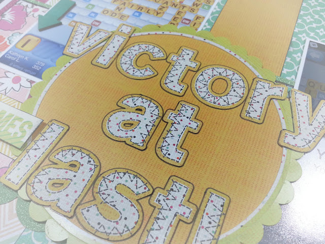
NEW VIDEO: Victory at Last!


I have a new layout and video to share with you today! This one features papers from the Basic Grey "Kneehighs" collection and the DCWV "Glitzy" glittered cardstock stack.

I would link to the DCWV "Glitzy" cardstock, but I can't find it anywhere on their website. It's AWESOME! Not like their normal glittered cardstock with the clear coating - it's uncoated, but doesn't shed. It's very similar to American Crafts POW! paper, only way cheaper.

Victory is mine! MWAH HAH HAH HAH!!!


My layout was based on this sketch from the My Scraps and More Sketch blog. There's currently a giveaway you can enter if you'd like to check it out! I followed the sketch pretty literally.
 
Click here to enter the sketch challenge!
 
 
I used a die cut from the collection that was definitely designed for a little boy, and altered it to fit my layout's theme. I cut off the bugs and turned it into a banner. Once I added a wood veneer heart from Studio Calico, it was totally girly!

It's all fun & games until someone loses an eye - then it's just fun.


There were a lot of bright, bold and busy patterned papers used on this layout. I tried to add space between them with white cardstock, embellishments, black ink, etc. This keeps everything looking fresh and popping off the page, instead of blending together into a blurry mess.

Add texture with layers of embellishments and a variety of finishes -
here we have matte, gloss, wood and glitter!


I made a large title in the center of the page with stickers from the collection. I used the distressed cardstock to keep it from looking too busy. That way I didn't have busy letters on top of busy patterned paper. To give the letters even more separation from the background, I outlined them with a black felt tip pen.

This title tried to kill me, but I survived!
Sometimes you have to show your supplies who's boss.
 
 
I filmed this layout coming together for my YouTube channel. You can watch the video below, or click this link to watch it over on YouTube: Victory at Last.


 Thanks for watching and have a GREAT day!
 
Kathryn :D


Tuesday, March 5, 2013

NEW VIDEO: Just One of the Girls, 12"x12" Layout


I have a new layout and video to share with you today! This one features papers from a new DCWV 6"x12" Stack called "Chickadee" and the Echo Park "Everyday Eclectic" collection.


I just love how these hot air balloons and clouds turned out!


I have this fun photo of Mr. Lifeguard standing in a booth at CHA. These girls managed to talk him into doing a make & take, so he's posing with his finished creation!


I used an app on my phone called Pudding.to to add the bokeh filter to the photo.


 These glitter letters came from Michael's and are their Recollections brand. They're a great size to add to your letter sticker collection. They're bigger than the small Tiny Type stickers, but not as large as Thickers - great for a long title or a sub-title.


Up, up and away!


These balloons were cut from the Echop Park papers. The clouds were cut from old school Scenic Route grid paper with the Sizzix Arrows, Banners, Chevrons & Clouds Thinlits. LOVE this die set!

The arrow stamp is from Studio Calico/Hero Arts. The heart wood veneer is from Studio Calico, and the diamond wood veneer is from Freckled Fawn. I used Colorbox Fluid Chalk Ink in Rose Coral to color the heart and Heidi Swapp Color Shine in Mustard to color the diamond.
 

Can't find a perfect match? Make your own custom embellishments!
 

I used the Mama Elephant "Smitten" stamp set to create this custom banner. I built the sentiment by stamping multiple sentiments in black ink on grey cardstock. Then I used a border punch to decorate a piece of paper from the collection and wrapped it around the cardstock. A little bit of string and I had a fabulous, custom embellishment! I love how it looks here.

 
Layer embellishments to add texture and movement to your pages!


I love how the balloons are layered over and under the clouds here. The clouds are then used as a space for some extra journaling (place and date) and embellishment. The fabric brad from the Dear Lizzy "5th & Frolic" collection gives some extra texture to the project.

I filmed this layout coming together for my YouTube channel. You can watch the video below, or click this link to watch it over on YouTube: Just One of the Girls.


 Thanks for watching and have a GREAT day!
 
Kathryn :D