
Just a quick layout share today. I went to a crop last weekend. I was there for six hours and all I got done was this one layout:
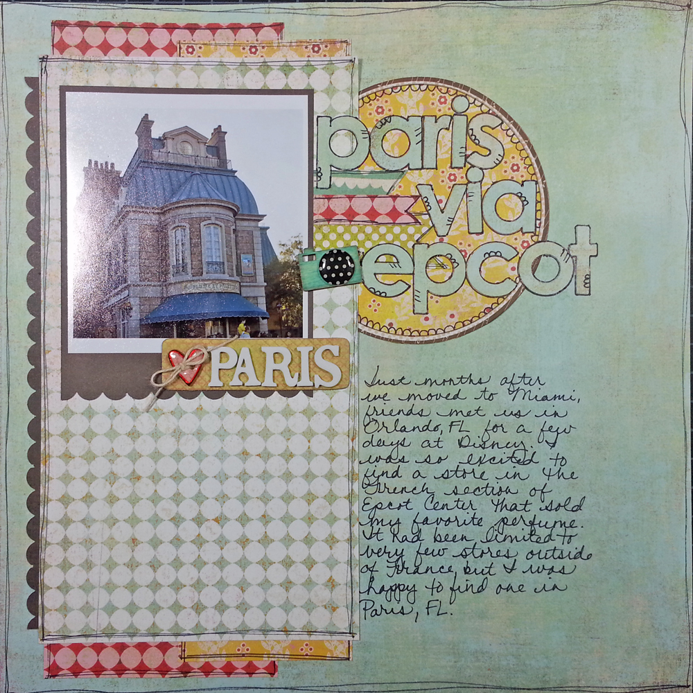
Since I only got one layout done, I made the photo EXTRA big.
Despite only getting one layout done, this crop was WAY better than the last crop productivity-wise. I got nothing done during my last crop because I forgot to bring photos or a paper trimmer.
This one is definitely going in the "win" column.
Anywho, since I just have the one layout to share, I thought I would use it as a little bit of a "what not to do" teaching opportunity. There is something that really bugs me about this layout. If I had done just one thing differently it would look much better.
The problem is in the dark mat around the photo. All design elements have a visual weight to them. Things that are darker in color are typically perceived as being "heavier" by our eye than things that are lighter in color. So, in this case, the dark mat is "heavy" to the eye, while the blue and white patterned paper is "light" to the eye. The brain perceives this in much the same way as it would perceive a bowling ball being supported by a feather - it doesn't think it makes sense.
The above layout would be much more pleasing to the eye if the photo and title were at the bottom of the blue and white mat, with the journaling above. Don't believe me? Check it out below. This photoshop job is far from perfect, but I think you can see what I mean:
The above layout would be much more pleasing to the eye if the photo and title were at the bottom of the blue and white mat, with the journaling above. Don't believe me? Check it out below. This photoshop job is far from perfect, but I think you can see what I mean:
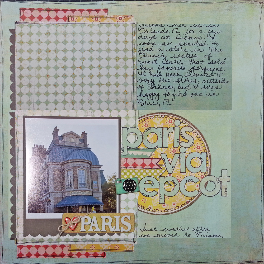
Changes it completely doesn't it? Now the building looks a lot more grounded and less like it is trying to float away into outer space.
This layout went into the album as it was since changing it would have involved way more time and UnDu than I had the inclination to spend on it, but it helps to see what might have been. Maybe next time I'll check the visual weight of my page BEFORE I start gluing down letter stickers.
This layout went into the album as it was since changing it would have involved way more time and UnDu than I had the inclination to spend on it, but it helps to see what might have been. Maybe next time I'll check the visual weight of my page BEFORE I start gluing down letter stickers.
Although maybe not since the next crop's theme is Spring Break & I am bringing margaritas.
Hope you guys all have a GREAT weekend! I am teaching the Bushel Box class at my local scrapbook store tomorrow, so I'll be cutting up chipboard all day. Whee!
Kathryn
P.S. I totally won the AccuCut photo contest! Thanks so much for all your help!
P.S. I totally won the AccuCut photo contest! Thanks so much for all your help!


WINNING! Glad you enjoyed the crop and thanks for sharing your tips.
ReplyDeletei like it both ways, so clearly i'm a confused scrapper, LOL! Congrats on the win! It was fun to help out. :)
ReplyDeleteKathryn, you can just cut the original in half and tape it back together on another 12x12 piece of cardstock. Simple solution! I voted for you so I'm glad you won!
ReplyDeleteYour explanation about the dark mat made so much sense, thank you! I can tell when one of my layout designs doesn't quite make sense but sometimes it's hard to figure out why, making it hard to correct, but now I'll know what to look for - thank you!!
ReplyDeleteI'm new to your blog and video's and absolutely LOVE your art!! It's been so much fun watching your video's and I'm learning SO much...thank you for sharing your time and incredible talent!